Recreo
Product Design
UX/UI Design
UX Research
Project Duration
Team
Tools
Role
4 Months (Jan-Apr 2025)
Kimiya Fani, Soyoung Jeong, Nicole Yan
Figma, Adobe Illustrator
Product Designer
Recreo is a community-focused recreational activity app designed for Baby Boomers to make it easier to discover, sign up for, and enjoy local programs.
This was a course project for the course DESN 2012:Prototyping and User-Centred Strategies at York University.
OVERVIEW
OVERVIEW
Older adults often need help with finding local recreational programs and navigating the process of signing up for them. Often times, they rely on direct interpersonal support and word-of-mouth recommendations, seeking the conversational validation of a community center staff member to ensure their registration is successful.
Recreo streamlines finding and signing up for recreational activities for Older adults by simplifying the registration process, providing multilingual support, and drawing conversational aspects from the experience of in-person sign-ups.
Baby Boomers often need help with finding local recreational programs and navigating the process of signing up for them. Oftentimes, they rely on direct interpersonal support and word-of-mouth recommendations, seeking the conversational validation of a community center staff member to ensure their registration is successful.
Recreo streamlines finding and signing up for recreational activities for Baby Boomers by simplifying the registration process, providing multilingual support, and drawing conversational aspects from the experience of in-person sign-ups.
Older adults often need help with finding local recreational programs and navigating the process of signing up for them. Oftentimes, they rely on direct interpersonal support and word-of-mouth recommendations, seeking the conversational validation of a community center staff member to ensure their registration is successful.
Recreo streamlines finding and signing up for recreational activities for Older adults by simplifying the registration process, providing multilingual support, and drawing conversational aspects from the experience of in-person sign-ups.
The Problem
The Problem
Older adults often face significant challenges with discovering and registering for recreational activities due to their varying levels of comfort with online registration systems.
Existing multi-step registration process and limited language support often impose a high cognitive load, leading to high abandonment rates. The prevalence of age-exclusive design resulting in social isolation and missed opportunities for active aging.
Older adults often face significant challenges with discovering and registering for recreational activities due to their varying levels of comfort with online registration systems.
Existing multi-step registration process and limited language support often impose a high cognitive load, leading to high abandonment rates.
The prevalence of age-exclusive design resulting in social isolation and missed opportunities for active aging.
Project Objectives
Project Objectives
Empowers users with varying comfort levels with technology to feel secure and confident
with every tap, when discovering or registering for recreational programs.Address language barrier and technology proficiency challenges in registration systems.
Empowers users with varying comfort levels with technology to feel secure and confident
with every tap, when discovering or registering for recreational programs.Address language barrier and technology proficiency challenges in registration systems.
My Role
My Role
Led the team in designing a user-centric product experience prioritizing accessibility and visibility of options.
Designed the onboarding experience—language setup, guided tour and Profile ID interfaces. Defined the branding identity of the product.
Conducted user research, user journeys, wireframes, prototype, usability testing, and high-fidelity designs.
Interviewed municipal recreational administrators, representatives, and members of target audience.
RESEARCH
RESEARCH
How we began...
Older adults often participate in recreational activities, but current systems are not designed to support them.
Older adults often participate in recreational activities, but current systems are not designed to support them.
They frequently feel alienated by complex UI patterns that lack human touch and tactile reliability of traditional, in-person registration.
With this in mind, we began breaking down the problem and looking into the current registration process our target audience would experience. We raised questions about the existing system to understand the core of the problem.
Problem Statement
Problem Statement
How might we design an app that allows older adults to access different recreational programs in one place and sign-up for them, while maintaining some aspects of in-person sign-ups that they are familiar with?
How might we design an app that allows older adults to access different recreational programs in one place and sign-up for them, while maintaining some aspects of in-person sign-ups that they are familiar with?
Research Goals
Research Goals
To guide us through our user research, we defined the following goals:
To guide us through our user research, we defined the following goals:
To guide us through our user research, we defined the following goals:
Program Discovery
Identify how Older adults discover and register for local recreational programs.
Program Discovery
Identify how Older adults discover and register for local recreational programs.
Registration Challenges
Examine Older adults’ registration preferences and challenges with digital platforms.
Registration Challenges
Examine Older adults’ registration preferences and challenges with digital platforms.
Future Research
With the outcomes, our next steps will be to use the findings to inform future research and designing the experience for our users.
Future Research
With the outcomes, our next steps will be to use the findings to inform future research and designing the experience for our users.
Methodology
Methodology
User interviews were conducted by walk-ins to local community centres around Toronto and sending emails.
User interviews were conducted by walk-ins to local community centres around Toronto and sending emails.
Initially, we were uncertain about securing interviews with older adults due to concerns about their reachability or hesitancy to participate in our interviews. Hence, an E-mail template was created to send out to community centre Administrators with expertise in our primary target audience.
Initially, we were uncertain about securing interviews with older adults due to concerns about their reachability or hesitancy to participate in our interviews. Hence, an E-mail template was created to send out to community centre Administrators with expertise in our primary target audience.
2
Interview
Scripts
Interview
Scripts
6
Emailed Centres
Emailed Centres
The E-mails were circulated to different recreational centres around the GTA, including Vaughan, and Markham.
The E-mails were circulated to different recreational centres around the GTA, including Vaughan, and Markham.


Why this method?
By walking-in to community centres we have access to talk with older adults who participate in recreational activities and Admins who provide and assist them with the sign-up process.
Many older adults may be more comfortable with face-to-face interaction than with an online survey or an email request. An in-person approach, even a brief one, can feel more personal, and trustworthy.
Sending out E-mails allowed us to have a larger scalability and reach to Administrators giving participants more time to provide more detailed and reflective answers.
By walking-in to community centres we have access to talk with Baby Boomers who participate in recreational activities and Admins who provide and assist them with the sign-up process.
Many Baby Boomers may be more comfortable with face-to-face interaction than with an online survey or an email request. An in-person approach, even a brief one, can feel more personal, and trustworthy.
Sending out E-mails allowed us to have a larger scalability and reach to Administrators giving participants more time to provide more detailed and reflective answers.
By walking-in to community centres we have access to talk with older adults who participate in recreational activities and Admins who provide and assist them with the sign-up process.
Many older adults may be more comfortable with face-to-face interaction than with an online survey or an email request. An in-person approach, even a brief one, can feel more personal, and trustworthy.
Sending out E-mails allowed us to have a larger scalability and reach to Administrators giving participants more time to provide more detailed and reflective answers.
How it went?
After two weeks, we were able to secure a total of 8 User Interviews. We were able to interview 4 Older Adults and 4 Administrators
After two weeks, we were able to secure a total of 8 User Interviews. We were able to interview 4 Older Adults and 4 Administrators
Research Findings
Research Findings
What did we learn?
From all 8 interviews, we organized the insights into common themes and identified pain points.
From all 8 interviews, we organized the insights into common themes and identified pain points.
In-person Registration Preference
Many older adults prefer in-person registration as they find them more familiar, accessible, and easier to navigate.
Many older adults prefer in-person registration as they find them more familiar, accessible, and easier to navigate.
“I like signing up in person because it's just easier. I’ve always done things face-to-face, that’s just what I’m used to.”
— Lucy, Baby Boomer
“I like signing up in person because it's just easier. I’ve always done things face-to-face, that’s just what I’m used to.”
— Lucy, Baby Boomer
System Complexity
The online registration process is challenging due to too many steps, cluttered interfaces, and technical barriers.
The online registration process is challenging due to too many steps, cluttered interfaces, and technical barriers.
“Older adults are a bit more intimidated by technology so occasionally we get feedback saying that using the online system creates more barriers.”
— Kerry Wakefield, Community
Recreation Manager, City of Markham
“Older adults are a bit more intimidated by technology so occasionally we get feedback saying that using the online system creates more barriers.”
— Kerry Wakefield, Community
Recreation Manager, City of Markham
Language Barrier
Non-English-speaking older adults struggle with registration due to limited language support, often needing assistance.
Non-English-speaking older adults struggle with registration due to limited language support, often needing assistance.
“[Baby boomers] don't know how to navigate, they can't speak English fluently. They'll get their friend to do it for them, maybe show them. So we really lean on them to show them how to use our system and the systems.”
— Eddie, Customer Service
Representative, City of Markham
“[Baby boomers] don't know how to navigate, they can't speak English fluently. They'll get their friend to do it for them, maybe show them. So we really lean on them to show them how to use our system and the systems.”
— Eddie, Customer Service Representative, City of Markham
Competitor Analysis
Competitor Analysis
We analyzed two popular current online registration system used in Toronto and compared their sign-up process flow.
We analyzed two popular current online registration system used in Toronto and compared their sign-up process flow.

After our user research we began asking ourselves…
Could this idea of making a simplified process/program just for older adults be interpreted as a “solution to a disability” to some?
If we introduce this idea, it may also be an inconvenience to the administrators: another tool to incorporate into their larger system. How do we address this?
Could this idea of making a simplified process/program just for older adults be interpreted as a “solution to a disability” to some?
If we introduce this idea, it may also be an inconvenience to the administrators: another tool to incorporate into their larger system. How do we address this?
DESIGN SOLUTION
DESIGN SOLUTION
DESIGN SOLUTION
DESIGN SOLUTION
Target User
Target User
Empathize | Who are our users?
Empathize | Who are our users?
The primary target users are active Older adults born between 1946 and 1964, dedicated to proactive health management and community involvement.
The primary target users are active Older adults born between 1946 and 1964, dedicated to proactive health management and community involvement.
These users are motivated to pursue active and healthy lifestyles—socially and physically—through programs that prioritize physical longevity and human connection.
These users are motivated to pursue active and healthy lifestyles—socially and physically—through programs that prioritize physical longevity and human connection.
Why this demographic?
Why this demographic?
Current online registration systems are often used by users outside this
age group.
This generation grew up with conversational, in-person sign-ups.
Current online registration systems are often used by users outside this
age group.
This generation grew up with conversational, in-person sign-ups.
Secondary User: Recreational Center Administrators
These admins are experts on the systems used to register for programs. They serve as facilitators and play a crucial role in designing, managing, and offering support for these programs.
Secondary User: Recreational Center Administrators
These admins are experts on the systems used to register for programs. They serve as facilitators and play a crucial role in designing, managing, and offering support for these programs.
Why this demographic?
Why this demographic?
They often work with Older adults to assist them during the registration process.
Often deal high volume of support requests from users who find the current systems difficult.
They often work with Older adults to assist them during the registration process.
Often deal high volume of support requests from users who find the current systems difficult.
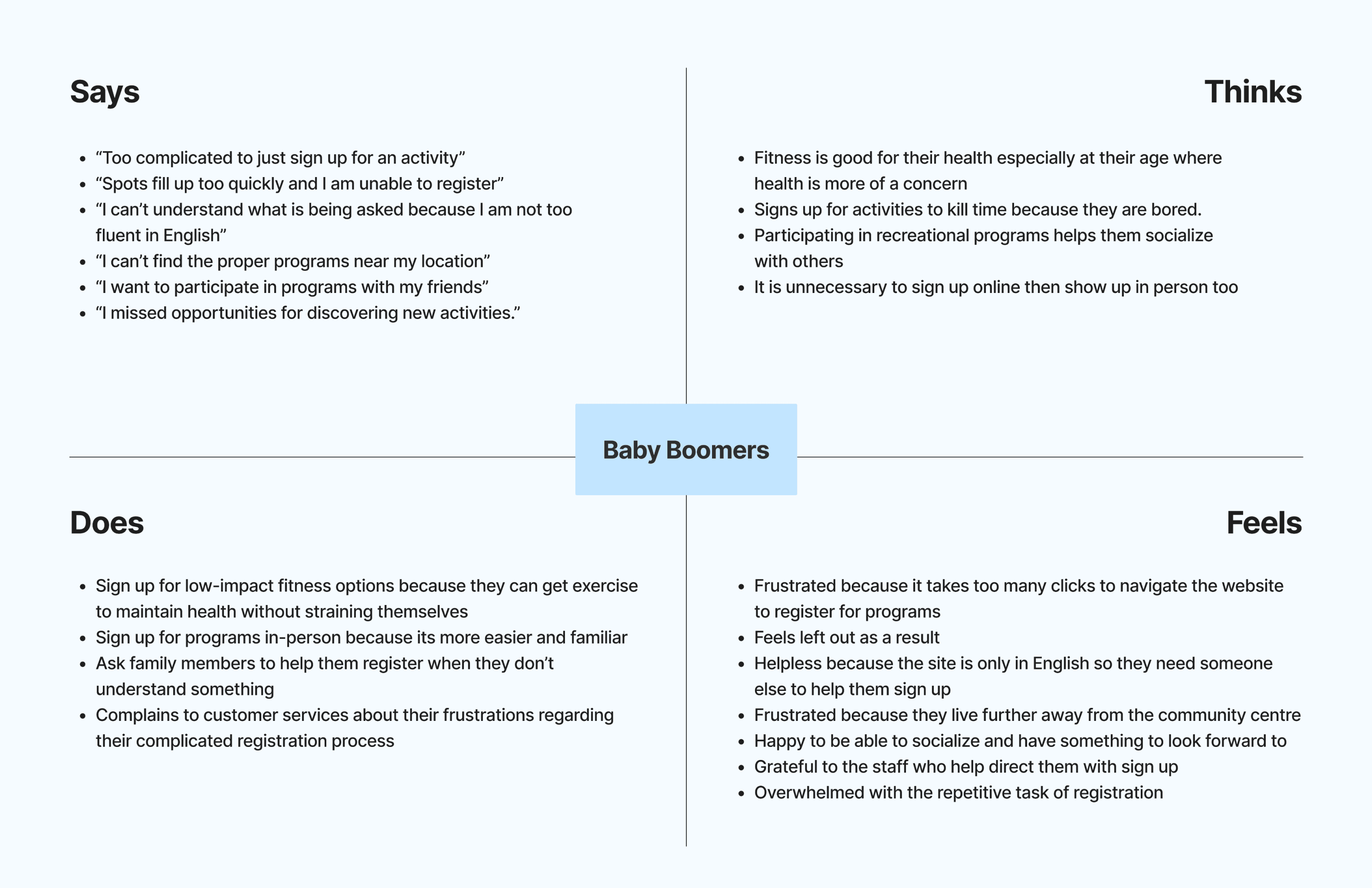
Personas & Empathy Map
Personas & Empathy Map
Who do we want to build for?
Who do we want to build for?
Journey Mapping
Journey Mapping
A user journey map based on the insights from the interviews was created to further understand the navigation process of discovering and registering for programs with the current system.
A user journey map based on the insights from the interviews was created to further understand the navigation process of discovering and registering for programs with the current system.

Ideation
Ideation
Ideate | How can we help our users?
Ideate | How can we help our users?
From what we learned from the user interviews, we translated those discovered pain points into opportunities to inform our solution.
From what we learned from the user interviews, we translated those discovered pain points into opportunities to inform our solution.
Top 3 Goals
Top 3 Goals
Guided Experience & Hybrid Support
Guided Experience & Hybrid Support
Walkthrough tutorial that mimics in-person process. AI Assistant to guide users or direct line of contact with customer services.
Walkthrough tutorial that mimics in-person process. AI Assistant to guide users or direct line of contact with customer services.
Less Clicks & Clear Affordances
Less Clicks & Clear Affordances
Minimal steps to complete a task and larger buttons.Providing visual cues, confirmations, and easy-to-understand icons.
Minimal steps to complete a task and larger buttons. Providing visual cues, confirmations, and easy-to-understand icons.
Multilingual Support
Multilingual Support
Multiple languages available. Prompting users to select their language at first launch.Simple and intuitive visual language supported by icons.
Multiple languages available. Prompting users to select their language at first launch.Simple and intuitive visual language supported by icons.
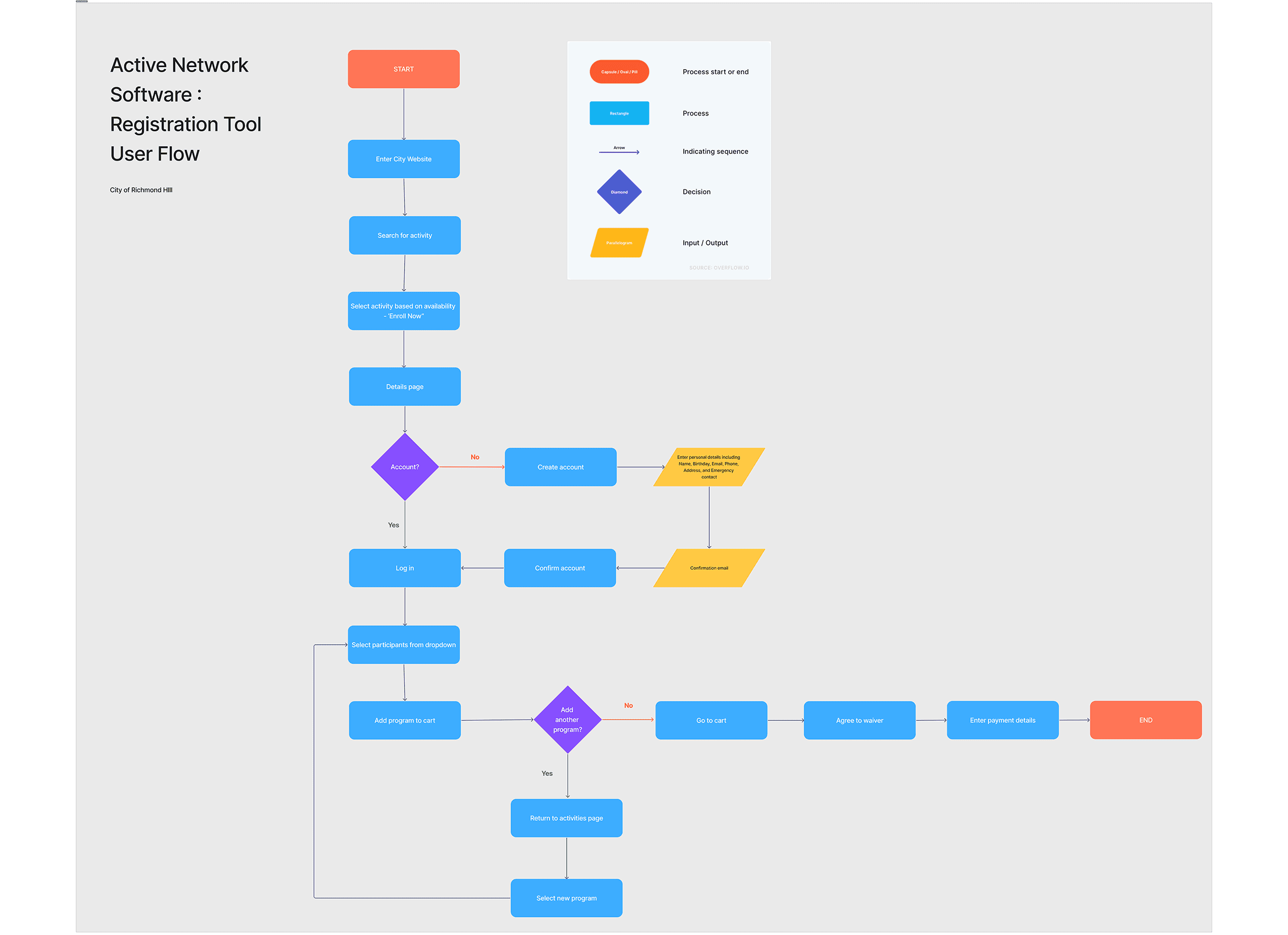
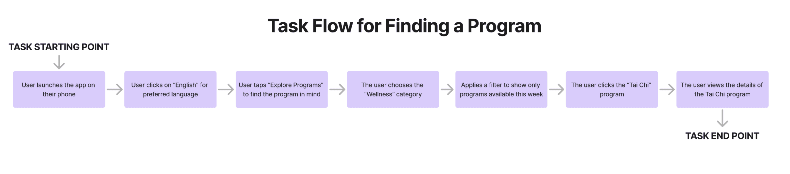
User & Task Flow
Two main user flows were created to address our problem. We focused on the task flows of finding a program and the registration process, all within the context of upon first download. I was responsible for Task flow 1: Onboarding experience and Finding a Program.
Two main user flows were created to address our problem. We focused on the task flows of finding a program and the registration process, all within the context of upon first download. I was responsible for Task flow 1: Onboarding experience and Finding a Program.
TASK 1 : Onboarding + Finding a Program
This task flow maps out the overall specific steps a user takes to find and select a program within the app. Visualizing the process from the user's entry point to their final selection, allow us to identify and remove unnecessary steps, streamline the navigation, and create a more efficient and intuitive path to the end goal.
This task flow maps out the overall specific steps a user takes to find and select a program within the app. Visualizing the process from the user's entry point to their final selection, allow us to identify and remove unnecessary steps, streamline the navigation, and create a more efficient and intuitive path to the end goal.
Wireframes
Wireframes
Low-Fidelity Paper Prototype
I created a paper mock-up of the task flow. This process allowed me to see what was working and what wasn’t, providing a foundation when designing the wireframes.
I created a paper mock-up of the task flow. This process allowed me to see what was working and what wasn’t, providing a foundation when designing the wireframes.

Mid-Fidelity Prototype
Building on previous user research, the identified key usability challenges such as language barriers, visibility of options, and system complexity were taken into account to inform the design of the app. A Spanish version of the app was developed as well for testing.
Building on previous user research, the identified key usability challenges such as language barriers, visibility of options, and system complexity were taken into account to inform the design of the app. A Spanish version of the app was developed as well for testing.

Usability Testing
Usability Testing
Can the solution we are building be used?
I developed a comprehensive testing plan to ensure the design addressed user needs. The plan outlines the task under test, business case, research objectives, methodology to gather efficiently valuable feedback and validate our design decisions.
I developed a comprehensive testing plan to ensure the design addressed user needs. The plan outlines the task under test, business case, research objectives, methodology to gather efficiently valuable feedback and validate our design decisions.

Testing Insights
Testing Insights
How did it go?
Overall, the app is perceived as simple and easy to use. When asked about their experience, both participants found the app intuitive and were able to navigate it without significant challenges.
Overall, the app is perceived as simple and easy to use. When asked about their experience, both participants found the app intuitive and were able to navigate it without significant challenges.
Participants successfully completed the task of finding a nearby fitness program, with only pain points occurring during the initial language and location setup.
Pain Points
Pain Points
Highlighted in red are the actions that can be performed in the prototype and notes were pain points were faced.
Highlighted in red are the actions that can be performed in the prototype and notes were pain points were faced.

The following key insights were identified about the overall prototype’s design and navigation process:
The following key insights were identified about the overall prototype’s design and navigation process:
Mistrust with Location Accuracy
Users may feel uncertain about pre-filled data as there is a lack of trust in the accuracy of the “Use my current location” feature.
User need reassurance that their location is being correctly detected and that they have control to adjust it if needed.
Users may feel uncertain about pre-filled data as there is a lack of trust in the accuracy of the “Use my current location” feature.
User need reassurance that their location is being correctly detected and that they have control to adjust it if needed.
“Perhaps one area where it could be improved is the ability to select the current location, with a map that can be displayed in case there is a geolocation problem.”
— Rudy, Baby Boomer
“Perhaps one area where it could be improved is the ability to select the current location, with a map that can be displayed in case there is a geolocation problem.”
— Rudy, Baby Boomer
Unclear Affordances & Intuitive UI Elements
Accessibility issues arose from unclear affordances and visibility issues. Users need a clearer visual distinction between what is interactive and what is static.
Accessibility issues arose from unclear affordances and visibility issues. Users need a clearer visual distinction between what is interactive and what is static.
Users struggled with tapping check- boxes, as they expected the entire label to be tappable rather than just the check-box
itself.
Users struggled with tapping check- boxes, as they expected the entire label to be tappable rather than just the check-box
itself.
Visually Lacking
Users value a more visually engaging interface that incorporates stronger contrast, icons, and images to aid comprehension. They need visual cues besides text alone, to feel more confident when navigating.
Users value a more visually engaging interface that incorporates stronger contrast, icons, and images to aid comprehension. They need visual cues besides text alone, to feel more confident when navigating.
“Make it more visual, have more contrast and images for people who don’t understand some things in writing.”
— Joanna, Baby Boomer
“Make it more visual, have more contrast and images for people who don’t understand some things in writing.”
— Joanna, Baby Boomer
The data collected from all usability testings and reviewed to identify common themes. Insights and feedback from usability testing were incorporated into the final solution.
The data collected from all usability testings and reviewed to identify common themes. Insights and feedback from usability testing were incorporated into the final solution.
Final Solution
Final Solution
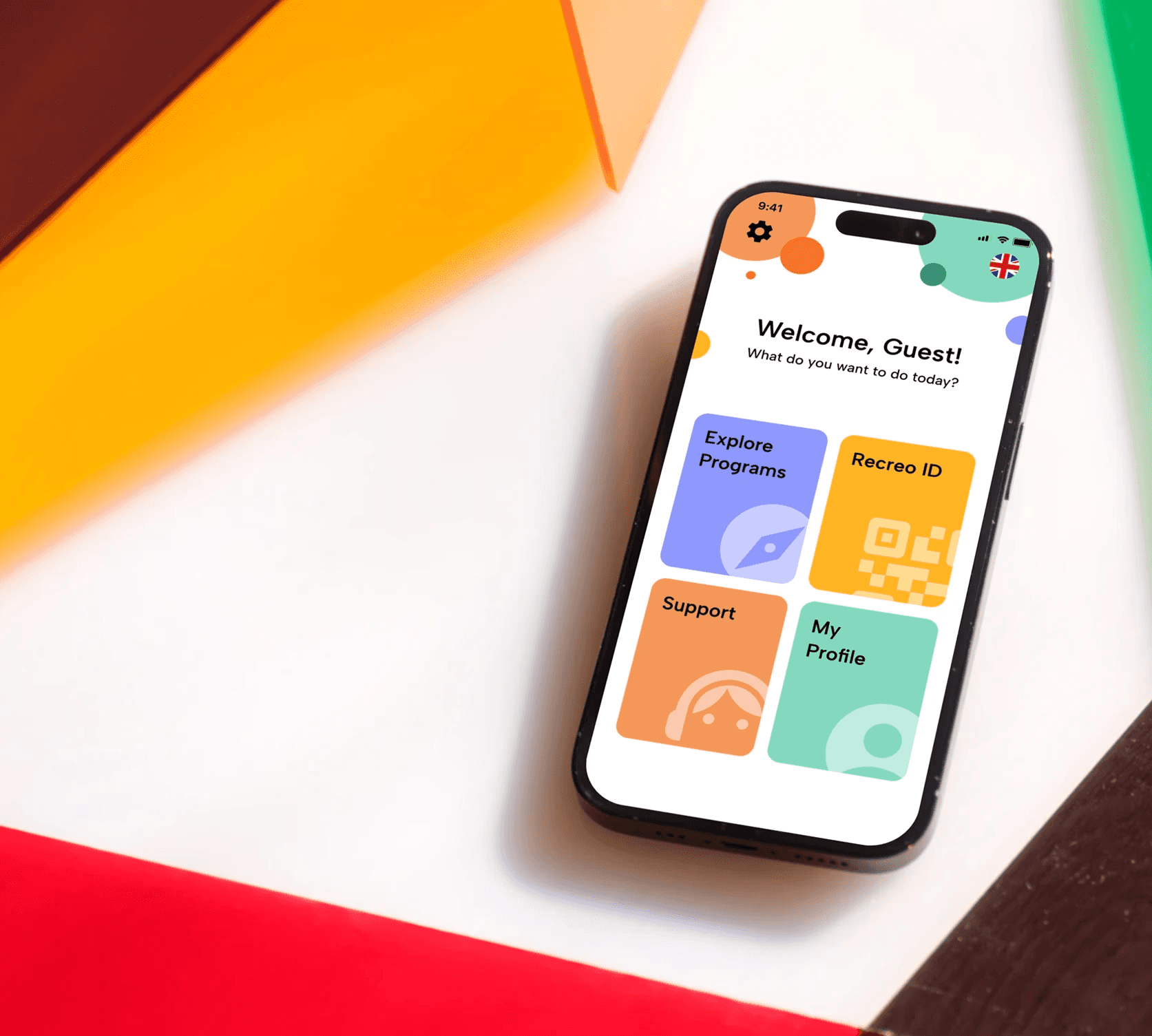
Introducing..
Recreo is a community-focused recreational activity app designed for older adults to make it easier to discover, sign up for, and enjoy local programs.
Recreo is a community-focused recreational activity app designed for older adults to make it easier to discover, sign up for, and enjoy local programs.
Recreo is a community-focused recreational activity app designed for older adults to make it easier to discover, sign up for, and enjoy local programs.
Multiple languages to support the diverse community of users in the GTA.
This feature tackles down language barriers, making the app more accessible and welcoming to all audiences.
Multiple languages to support the diverse community of users in the GTA.
This feature tackles down language barriers, making the app more accessible and welcoming to all audiences.
A quick animated tour of the home menu interface to guide new users.
Empowers users with varying comfort levels with technology by providing a friendly, visual guide.
The tour is optional, as it caters to both users who need a little guidance and those who are already comfortable with technology.
A quick animated tour of the home menu interface to guide new users.
Empowers users with varying comfort levels with technology by providing a friendly, visual guide.
The tour is optional, as it caters to both users who need a little guidance and those who are already comfortable with technology.
A quick animated tour of the home menu interface to guide new users.
Empowers users with varying comfort levels with technology by providing a friendly, visual guide.
The tour is optional, as it caters to both users who need a little guidance and those who are already comfortable with technology.
Recreo ID replaces tedious, multi-step forms with one-time registration profile designed for instant check-ins.
Addresses the issue of repeated registration steps with a saved QR profile for users to quickly sign-up for activities by simply having their unique code scanned at a facility.
Recreo ID replaces tedious, multi-step forms with one-time registration profile designed for instant check-ins.
Addresses the issue of repeated registration steps with a saved QR profile for users to quickly sign-up for activities by simply having their unique code scanned at a facility.
Register for activities in 3 simple steps. Reduced to 2 if they create a Recreo ID.
Register for activities in 3 simple steps. Reduced to 2 if they create a Recreo ID.
A guided experience with an AI voice assistant to drawing conversational aspects from in-person sign-ups.
Auditory feedback and chatbot system to ensure users feel supported and reassured.
Makes the registration process feel more personal and less intimidating for users.
A guided experience with an AI voice assistant to drawing conversational aspects from in-person sign-ups.
Auditory feedback and chatbot system to ensure users feel supported and reassured. Makes the registration process feel more personal and less intimidating for users.
A guided experience with an AI voice assistant to drawing conversational aspects from in-person sign-ups.
Auditory feedback and chatbot system to ensure users feel supported and reassured.
Makes the registration process feel more personal and less intimidating for users.
Final Screens Overview
Final Screens Overview
APP Demo
APP Demo
Next Steps
Next Steps
Further testing
A second round of usability testing is planned with a broader user group to gather more comprehensive feedback on our new designs and features.
A second round of usability testing is planned with a broader user group to gather more comprehensive feedback on our new designs and features.
Our next steps are focused on refining the prototype by further integrating read-out-loud assistance to more screens.
Based on user research and phase 1 user testing, our team adjusted and merged our individual prototypes into one application. Our goal is to understand if the changes made (i.e. adding different kinds of feedback, features like saved programs, verification step etc.) further support the user and their goal to complete a registration successfully.
Our next steps are focused on refining the prototype by further integrating read-out-loud assistance to more screens.
Based on user research and phase 1 user testing, our team adjusted and merged our individual prototypes into one application.
Our goal is to understand if the changes made (i.e. adding different kinds of feedback, features like saved programs, verification step etc.) further support the user and their goal to complete a registration successfully.
Branding
Branding
Why Recreo?
“Recreo” means recess or recreation in Spanish. The name reflects leisure, community, and the joy of participating. It reflects our mission to provide users with opportunities to enjoy their free time and connect with others.
“Recreo” means recess or recreation in Spanish. The name reflects leisure, community, and the joy of participating.
It reflects our mission to provide users with opportunities to enjoy their free time and connect with others.
The branding for Recreo was designed to communicate its core purpose: fostering an active and accessible community. Our logo features people linked together to represent this mission visually. It reflects the idea of an interconnected network of people and activities.
The branding for Recreo was designed to communicate its core purpose: fostering an active and accessible community. Our logo features people linked together to represent this mission visually. It reflects the idea of an interconnected network of people and activities.
The app’s colours were chosen to create a sense of youthful energy and excitement.
We wanted the user to feel energetic and optimistic when signing up for a program, and create a feeling of anticipation.
- Orange (Movement)
- Green (Health)
- Yellow (Optimism and Energy)
- Purple (Inspiration)
The app’s colours were chosen to create a sense of youthful energy and excitement.
We wanted the user to feel energetic and optimistic when signing up for a program, and create a feeling of anticipation.
- Orange (Movement)
- Green (Health)
- Yellow (Optimism and Energy)
- Purple (Inspiration)
The app’s colours were chosen to create a sense of youthful energy and excitement.
We wanted the user to feel energetic and optimistic when signing up for a program, and create a feeling of anticipation.
- Orange (Movement)
- Green (Health)
- Yellow (Optimism and Energy)
- Purple (Inspiration)


TAKEAWAYS
TAKEAWAYS
Reflection
Reflection
Recreo provided me hands-on experience of how to translate user needs into opportunities in order to create intuitive and effective design solutions.
Recreo provided me hands-on experience of how to translate user needs into opportunities in order to create intuitive and effective design solutions.
Although the design did not reach its full potential, during the 4 months of this project, I was able to develop my skills across various stages of product development, from initial user research to final prototype and visual identity.
Although the design did not reach its full potential, during the 4 months of this project, I was able to develop my skills across various stages of product development, from initial user research to final prototype and visual identity.
What did I learn?
What did I learn?
Strategic User Research
Strategic User Research
Learned how to be resourceful and leverage indirect data about primary users by observing and interviewing related groups.
Learned how to be resourceful and leverage indirect data about primary users by observing and interviewing related groups.
From Data to Design
From Data to Design
Planned a comprehensible outline to guide the user research process and usability testing. Analyzed data to validate design choices and identify areas for improvement.
Planned a comprehensible outline to guide the user research process and usability testing. Analyzed data to validate design choices and identify areas for improvement.
Leadership & Team Work
Leadership & Team Work
Learned to be an effective team player. Took initiative in organizing discussions and setting actionable goals, while providing constructive feedback.
Learned to be an effective team player. Took initiative in organizing discussions and setting actionable goals, while providing constructive feedback.
Storytelling
Storytelling
Learned to tell a narrative to offer a more engaging presentation of our journey and design process.
Learned to tell a narrative to offer a more engaging presentation of our journey and design process.
Challenges
This project taught me valuable lessons through the different challenges that presented during design thinking process and iteration of the product.
This project taught me valuable lessons through the different challenges that presented during design thinking process and iteration of the product.
Visual Hierarchy
Visual Hierarchy
Prioritizing visibility without overcrowding the UI. Establishing a clear visual hierarchy that reduces system complexities and not induce them.
Prioritizing visibility without overcrowding the UI. Establishing a clear visual hierarchy that reduces system complexities and not induce them.
Time Constraints
Time Constraints
Managing different schedules of a diverse team. We had to established a timeline of milestones to meet to stay on track with the project deadlines.
Managing different schedules of a diverse team. We had to established a timeline of milestones to meet to stay on track with the project deadlines.
Work Division
Work Division
Working with team members who had different areas of expertise, we had to ensure we had clear communication about the work division.
We established a system for regular check-ins and shared our progress and feedback.
Working with team members who had different areas of expertise, we had to ensure we had clear communication about the work division.
We established a system for regular check-ins and shared our progress and feedback.